By JoAnne Sommers
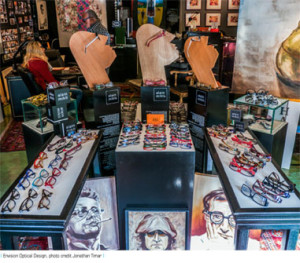
 With colourful paintings adorning the walls, Persian rugs carpeting the floor, the scent of incense wafting through the air and Billy Holiday crooning in the background, Envision Optical Designs in Vancouver’s trendy Kitsilano neighborhood offers a feast for the senses.
Owner Monny Nahoum’s store is a great place to find the latest in designer frames from Europe, Asia and North America. It is also an excellent example of sensory marketing in action.
Sensory marketing, whereby multiple senses are stimulated in order to heighten a product’s appeal, is an increasingly popular technique for enhancing consumer experience. Many well-known companies have leapt aboard the sensory marketing bandwagon: Singapore Airlines has a signature scent which makes frequent flyers feel more at home and enhances their flying experience; Starbucks has soundtracks to complement the smell and flavour of its coffee; and Westin Hotels and Resorts feature warm lighting, beautiful botanical arrangements, signature music and scents, all designed to create an emotional connection with guests.
Traditionally, most marketing efforts were directed at the eyes and ears, while the other senses were largely neglected. Today, with the competition for consumers’ attention so intense, there’s a growing belief that no sense should be left unstimulated.
“Whether it is the colours one sees, the packaging one opens or the music in the store, each experience draws, engages, and leaves behind an indelible trace,” says Aradhna Krishna, professor of marketing at the Ross School of Business, University of Michigan, and author of Customer Sense: How the 5 Senses Influence Buying Behavior (Palgrave Macmillan, 2013).
At a time when online eyewear dispensing poses a significant challenge to bricks and mortar dispensers, sensory marketing offers the latter a valuable opportunity to distinguish themselves by creating truly memorable in-store shopping experiences.
As the 2011 Customer Experience Impact (CEI) Report from RightNow Technologies noted, “Today it is nearly impossible for companies to sustain differentiation based on price or product. That leaves only one option – the customer experience. Customers want personal and engaging experiences that develop into relationships.”
They’re willing to pay for it, too: 86 per cent of consumers surveyed for the report said they would pay more for a better customer experience.
****
 Nahoum, who was a fashion photographer and style consultant, before opening Envision Optical Designs in 1988, says his store’s sensory elements help to create a warm, inviting atmosphere, which his customers savour. Everything – from the lavender and geranium incense to the lush jazz soundtrack to the paintings by talented local artists – is designed to contribute to a stimulating and enjoyable shopping experience for his customers.
“It’s about more than just trying on a pair of frames,” says Nahoum. “I get very positive feedback from people who tell me they look forward to visiting and seeing what’s new in the art gallery.”
The art gallery ties in with Nahoum’s approach to eyewear, which he calls, “art for the face.” And the environment puts customers in a positive, relaxed frame of mind, which is important, “because it takes about an hour when I work with someone new.”
*****
The atmosphere at the 165 IRIS eyecare locations across Canada is also designed to put customers at ease so staff can discuss their needs and determine which products will best fill them.
“Patients are seated in a living room-like setting and offered a beverage,” says Dr. Daryan Angle, vice president of Professional Relations with IRIS the Visual Group. “The atmosphere is warm and homey because we want to establish a level of trust with them.”
Angle says the company tries to engage the senses as a way to enhance the customer experience from the first contact right through the fitting process.
All of the company’s stores are recognizably IRIS locations, he adds. “The look is high-end with dark oak finishes combined with rock faces. Our soundtrack is classic light pop, designed to appeal to our target demographic, which is women 35+. And we’re working on perfecting a scent for our locations. The challenge is that some people have allergies and we want to be sensitive to that.”
It’s important to strike a balance when it comes to the senses, however. “To engage the sense of touch, for instance, we shake hands and take their arm if it’s appropriate. But we’re always careful to respect the customer’s space.”
Angle sees the sensory approach, “as one way to differentiate ourselves. With the rise of online dispensing the experience must be better than it was a few years ago. To achieve our average eyewear transaction of more than $700, you need to create a special atmosphere without going over the line.”
In the long term, IRIS believes its approach will result in a higher average customer purchase.
“We also think it will lead to more frequent purchases so it will contribute to sales growth. Despite the current pressures on the industry, we’ve maintained market share and grown a little. Our focus on customer experience has been crucial to that. When things improve, we will have maintained our loyal customer base and created a much stronger connection to them, which will position us for further growth.”
****
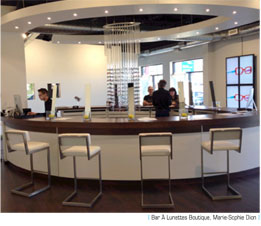
Marie-Sophie Dion has created a unique minimalist experience for customers who visit her four Bar à Lunettes locations in Quebec.
The walls are white and each room is large and airy, with ultra-high ceilings and curved  walls. Large windows admit plenty of natural light, and big LED spots on the ceiling direct a « natural » light colour onto the walls, creating a reflection and brightening the room. Dark wooden floors add warmth to the decor.
Acrylic rods suspended from the ceiling showcase frames and sunglasses. In the centre of the showroom is the bar, with dark wood counters and 10 stools made of white leather and stainless steel.
“I want our decor to please customers who appreciate modern, avant-garde design,” says Dion, whose locations include Montreal, Saint-Lambert, Laval and Sherbrooke. “And I want people to feel they are not in Canada, but on a journey somewhere, with no country or period attached to the moment.”
Music is very important to Dion, since the stores are so large. “Without it, they would feel cold and empty. We have an itunes music radio channel and the style is electronic lounge.”
Dion says she is developing a personalized fragrance to complement the customer experience. “It is a citrus scent because the lemon is part of our concept’s image: the eyewear “bar”. And lemons are the only fruit you need when opening a bar.”
*****
Three optical businesses – three different approaches to sensory marketing – and each as unique as the clientele they are designed to attract. The lesson is simple – appealing to the senses pays off. How do you stack up?
Putting the “Pop” in POP
Point-of-purchase materials (POP) play an important role in creating a stimulating sensory environment for consumers. Appealing window treatments draw people into your optical store, while attractive display systems, pleasing images and engaging educational tools all contribute to making it a memorable experience.
“POP is an excellent way to attract, educate and inform consumers,” says Glen Eisenberg, president of Montreal-based Precision Advertising, whose clients include WestGroupe and IRIS, the Visual Group.
In general, POP enhances the presence of a brand or product line, says Eisenberg. The challenge is ensuring that the messaging is relevant to consumers and communicating it in a way that resonates with them.
“If there are 1,000 frames on your board representing 60-70 brands, anything that brings a brand forward will make it stand out,” he explains. “If you add strong, relevant messaging about the brand proposition, it creates an additional impression beyond the product itself.”
Many manufacturers are developing innovative POP displays, including window units that help to create an interesting merchandising story, says Eisenberg. For all of the WestGroupe brands, Precision Advertising has developed a suite of materials, including banners, counter cards and ancillary products, which sales reps can use to create such a story, either in windows or inside the store.
“This is a core part of WestGroupe’s marketing strategy,” says Eisenberg. “They want to impact customers who visit the store at a sensory level.”
WestGroupe also provides its customers with behind-the-scenes video from fashion photo shoots, says Bev Suliteanu, vice-president of product development. “Many of them use it, along with our campaign video, on their in-store video monitors.”
IRIS, the Visual Group uses LCD screens to explain the features of its digital lens products to customers, says Dr. Daryan Angle, vice-president of professional relations.
“It’s difficult to communicate the benefits verbally,” he says. “Using programs from Zeiss and Nikon we can show the higher contrast, sharper colours and wider fields of view available with these products.”
The systems can be programmed to change as new promotions become available, Angle adds. “It’s cheaper than printed materials and the high-resolution images are more eye-catching.”
Transitions Optical’s Marketing Manager Isabelle Tremblay-Dawson believes that it’s more important than ever for optical customers to have the best possible shopping experience, since those who do are more likely to recommend the store to family and friends and to return themselves.
“We need to differentiate our brands based on the customer experience, as well as the products we’re selling,” she says.
To facilitate that, Transitions offers a wide range of POP materials and patient education tools that demonstrate the benefits of its products. For instance, the company provides clients with UV demo light units and lens cards, which demonstrate the benefits of photochromic technology in-office.
“It can be difficult for patients to understand the technology if they get only a verbal explanation. With our tools, the ECP can place the lens card, which holds a regular, semi-finished lens, in a UV unit to show it activating and then fading.”
Other POP materials include window clings that tie into the look and feel of Transitons’ “Life Well Lit” ad campaign. “They help patients make the connection between our mass media campaign and the product in-store,” says Tremblay-Dawson.
Marchon has an innovative way of keeping its clients up to date with fresh POP material. “Each season, select accounts receive a USB key that activates Lacoste’s 4-piece integrated video display,” says Marketing Manager Kristina Simeone. “It’s a great display, featuring music as well as images, that started with Lacoste’s Magnetic Frame collection in 2012. This year, accounts received a key to access the video celebrating Lacoste’s 80th anniversary.”
The window displays, counter cards, cubes and window clings for Marchon’s brands are especially popular with optical stores in Canada, says Simeone. “Accounts are realizing the benefits of improved communication and are seeking materials with an added benefit or “wow factor”. The video display educates the audience on the brand while creating a stronger relationship with each consumer.”
Tura, Inc. reflects the quirky, playful nature of the Ted Baker Eyewear and LuLu Guinness eyewear brands with dynamic POP, says Marketing Director Lidia Parisi.
Ted Baker is positioned as a brand with attitude, appealing to a broad target audience of men and women, both young and the young at heart. Its « out of the ordinary » philosophy is reflected in the POP, which includes a small suitcase and trunks that are, “very quirky, just like Ted Baker,” says Parisi.
The iconic image of LuLu Guinness is a large pair of red lips, which reflects the designer’s individual style and glamour. The red lips are incorporated in a three-piece display and logo ID for the brand.
“We want our POP to have standout value,” Parisi says. “It’s more interesting than traditional merchandising stands and people love it.”
Sàfilo’s POP reflects the company’s position as the purveyor of exclusive luxury brands and helps to create a positive first impression of optical stores that carry them, says Wendy Bertrand, the company’s Toronto-based in-store visual merchandising specialist. “Our products, their packaging and the store environment all reflect that position,” she says.
Sàfilo creates a marketing plan for each account annually, which specifies how the various visual elements will be used. Says Bertrand: “We show clients what’s available for premium displays as well as what’s upcoming and we change it seasonally. For key accounts, windows are changed four to five times a year, using different brands.”
Lighting and movement provide important visual appeal, she adds. “Movement, either in windows or in-store, catches the customer’s attention. Lenticular displays can be used in the front window so the store attracts passers-by, even when it’s closed. Lighted sign holders and Illuminated light box posters are important to accounts, as are videos specific to our brands: our trend video, which talked about the different brands and eyewear trends for summer, was very popular. All of these elements enhance the customer experience and impact the bottom line positively.”
Engaging the Senses
Paco Underhill is president of New York-based Envirosell, an international marketing company that specializes in analyzing the interaction between people and products in commercial spaces. Underhill, who has worked with optical retailers around the world, including Canada, is also the author of Why We Buy: The Science of Shopping (by Simon and Schuster, 1999).
“Every merchant in 2013 is trying to think about all the senses,” he says. “They recognize that managing the customer’s sensory experience can be a powerful subliminal tool. But it often takes a very light hand.”
Here is Underhill’s advice for creating a positive sensory experience for your customers:
• Sight
Lighting is among the easiest and cheapest ways to improve the quality of the customer experience, he says. Pay attention to the quality of the lighting and match the colour “temperature” to the environment and your customer mix: generally, the more pink-skinned your clients, the warmer the lighting should be, and the more olive-skinned they are, the cooler it should be.
“It’s a matter of making people look as good as possible while they’re wearing your frames,” he says.
• Touch
Having patients try on frames of different weights is one way to involve their feeling sense, says Underhill. Another is to physically adjust the glasses on the patient’s face.
“Explain that the more money they spend on frames, the lighter they will feel on their face,” he advises. “The time and care you take at this point will earn you customer loyalty.”
• Sound
There are two elements to this. The first is to eliminate unpleasant sounds. Carpeting can help to absorb sound in a noisy showroom and white noise units also absorb noise and contribute to a peaceful atmosphere.
The second element is music, “A sound track of some kind adds to the pleasure of being in a space and it can be customized to the time and the day,” Underhill notes. “For instance, you might want to play the Beach Boys or Death Cab for Cutie on a Monday morning but Sinatra on Saturday night.”
• Smell
This can be important in an optical setting where machines are operated, notes Underhill. “You may be oblivious to it but others will notice,” he says.
The underlying smell should always be clean, he adds. “Make sure that any scent you introduce is subtle. You don’t want to overwhelm people. And remember that some people are allergic to scents so ensure that it’s gentle.”
• Taste
You can appeal to your customers’ sense of taste by offering them tea, coffee or a soft drink as part of the welcome process. This helps to put people at ease and gets them talking about their work, lifestyle, etc., all of which has a bearing on their vision needs and challenges.
“When the saliva glands are working, the wallet is looser,” says Underhill.


